MoneyMerge
MoneyMerge is a financial app that enables users to centralize their financial accounts and streamline transactions.

Tools
- Figma
- Adobe Fresco
- Google Forms
- Miro
- Optimal Workshop
- UserCrowd
Role
Research & UI/UX Design
Timeline
November 2022 - April 2023
Problem Statement
Financial app users struggle with managing their money due to the scattered approach of accessing multiple sites for account management. Users need a centralized platform that can consolidate all their financial accounts, enabling them to simplify and efficiently manage their money.
Hypothesis
The implementation of a secure tool that enables users to link their financial accounts and cards, facilitating transactions and providing centralized financial management, will lead to improved efficiency and convenience in managing personal finances.
Features
- View account balances & transactions
- Create personalized budgets
- Send & request money
- Scan to make in-store payments
- View recurring payments & subscriptions
Competitive Analysis
Learning from established companies already tackling the problem
I researched Intuit Mint and PayPal, creating comprehensive competitive and marketing profiles, as well as SWOT analyses. Additionally, I performed a UX-focused competitive analysis on Intuit Mint, where I identified any ineffective app elements.

Intuit Mint
Strengths
- Robust algorithm and data security measures
- Customizable and editable options for users
- Web navigation is organized
Weaknesses
- Ads are intrusive, repetitive, and reappear shortly after exiting them
- UI on web layout looks complex
- Mobile navigation isn't organized logically
- Features weren't usable or functioning as described

PayPal
Strengths
- Allows users to pay online and in-store with a QR code
- Offers deals and discounts with retailers
- Provides robust ways to transfer money
- Accepts multiple forms of payment
Weaknesses
- High fees for processing invoices and sending personal transactions
- Can only view transactions made through PayPal
- Information architecture needs improvement
- Several ads to apply for their credit card
User Research
Listening to people who are actually experiencing the problem
I surveyed 46 people who manage their finances, and I interviewed three survey respondents from various backgrounds.
Key Survey Insights

94% have 2+ financial accounts

63% manage their finances at least 1x/week

89% currently budget or are interested in budgeting
Interview Topics
- Their shopping habits
- Their process of managing finances
- Their budgeting methods
- Their experience with digital wallets
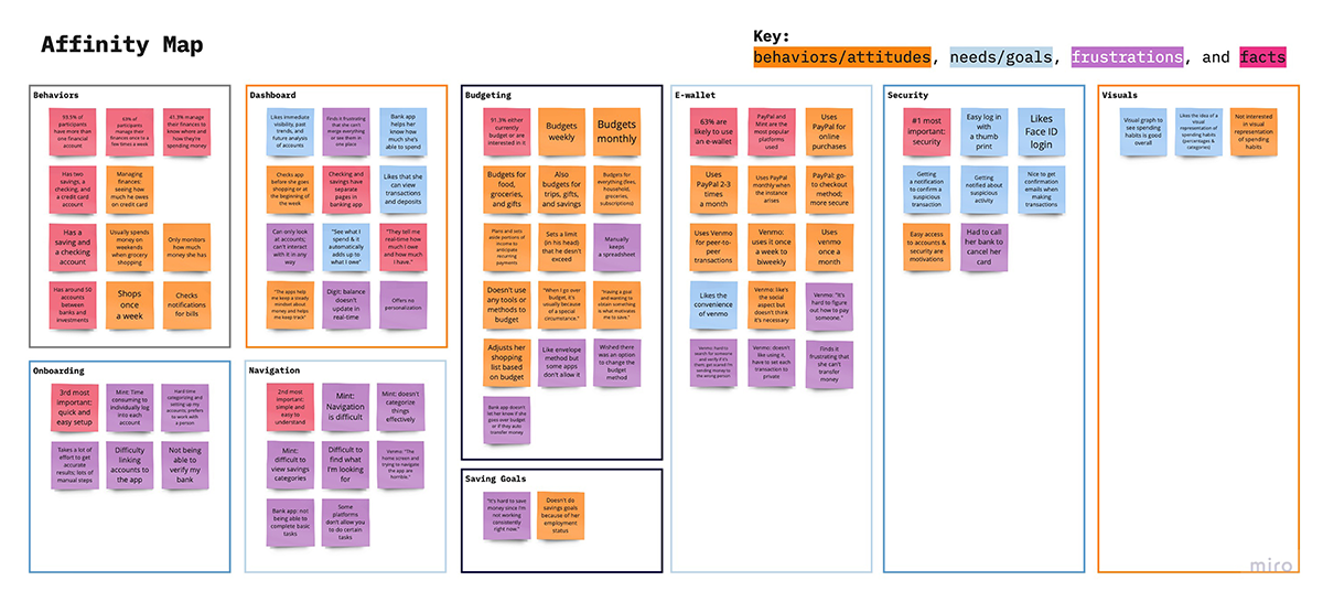
Insights
- Most people shop weekly
- Security is of the most importance when using financial platforms
- People prefer real-time account updates
- Some make peer-to-peer transactions monthly
- People use e-wallets because they are secure and easily accessible
- Some people dislike when apps offer no personalization
Affinity Map
Ideation
Defining solutions and exploring site structure
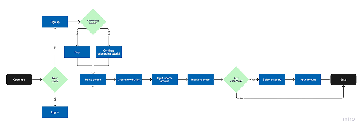
Michael's User Flow
User Story
As a planner, I want to create a budget, so that I can achieve financial stability.
Success Criteria
Budget is created
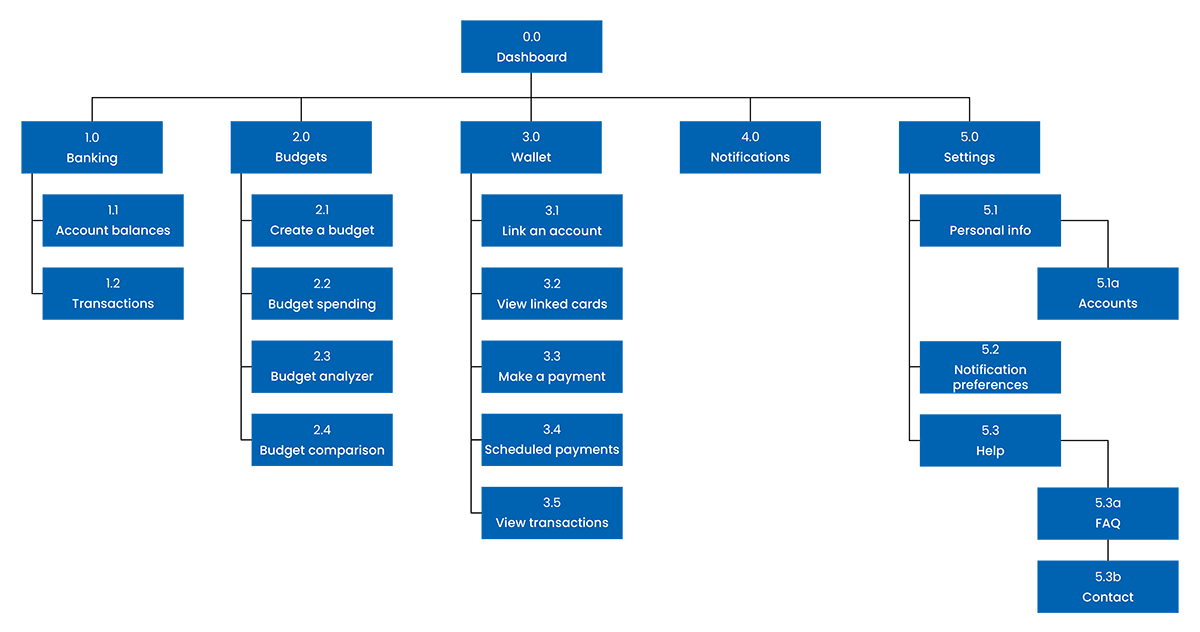
Sitemap
I evaluated the architecture with an open card sort after creating the initial sitemap. Most of my findings were validated, but the banking items were inconsistent. In this revised sitemap, I renamed the Banking tab and added a transactions section to the Wallet tab.
Wireframe
Turning ideas into something tangible
Design
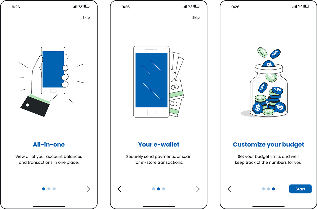
Intro Sequence
Familiarize yourself with MoneyMerge by learning about its main features and how it works.
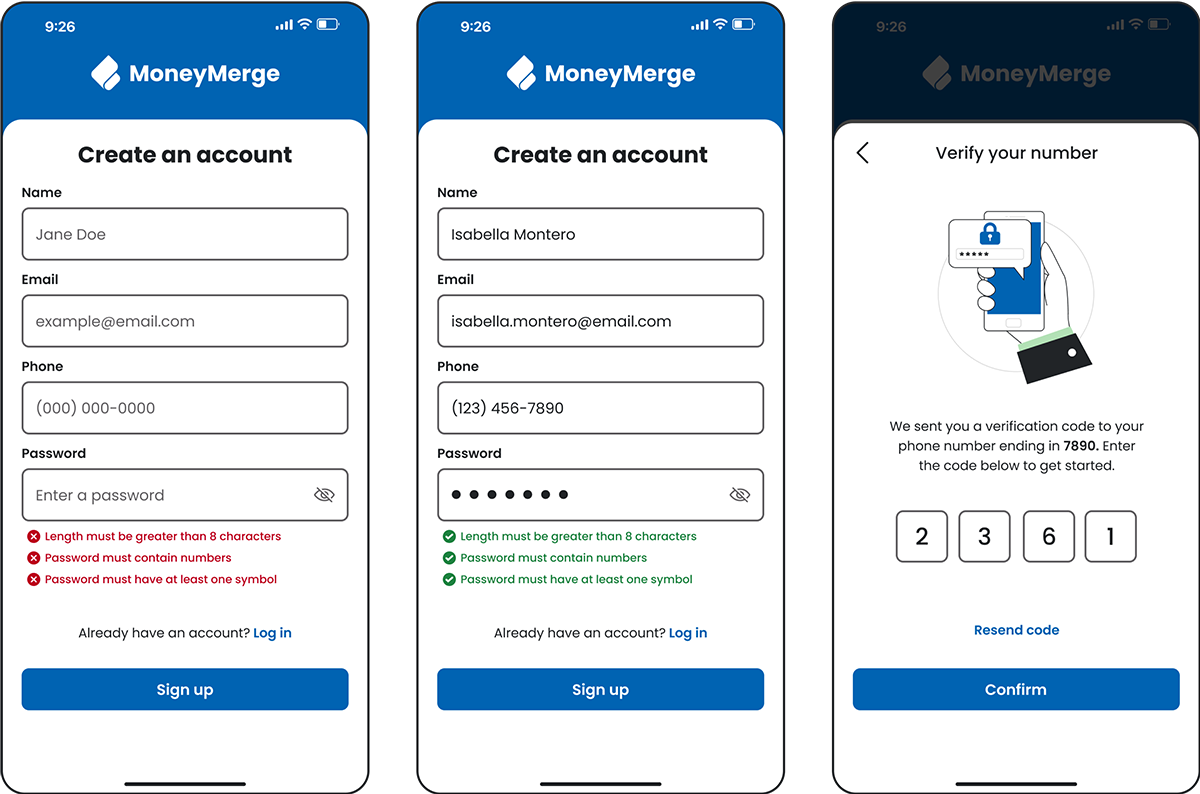
Sign Up & Log In
As a new user, create an account and verify your phone number, or log in using biometrics.
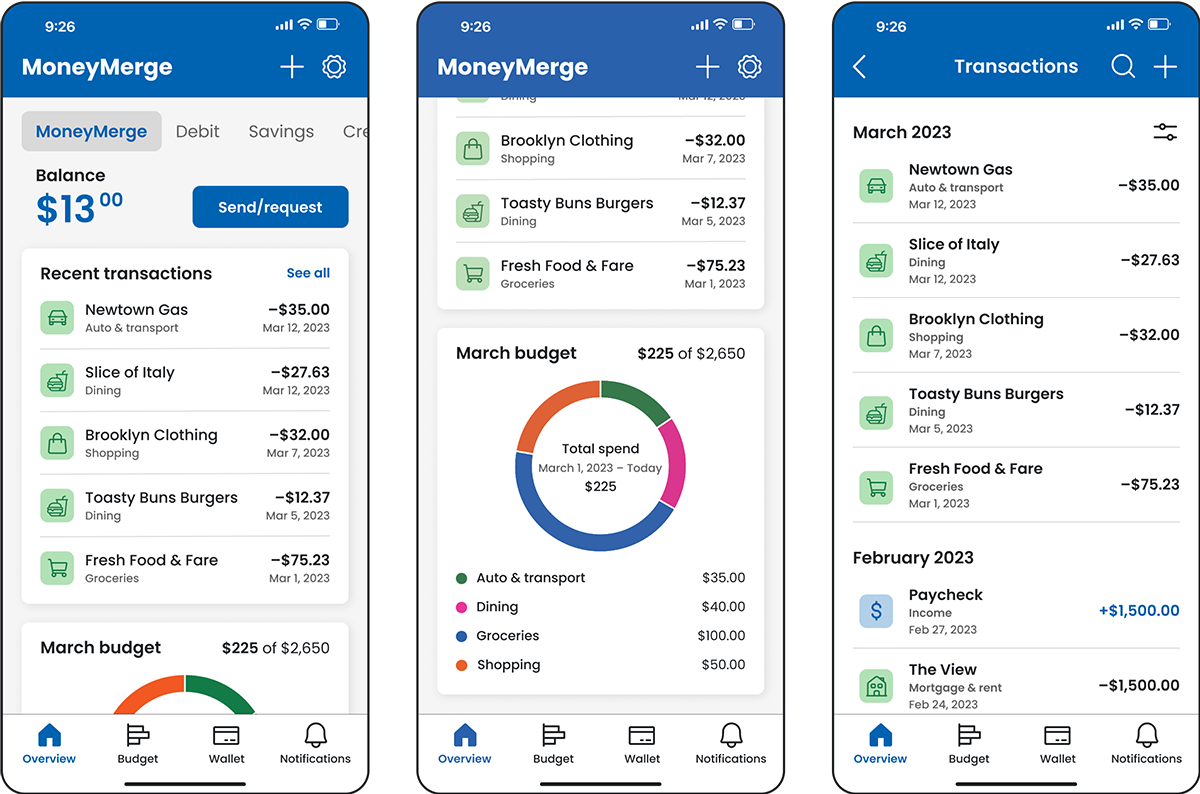
Overview Tab
Get a quick overview of your account balances, recent transactions, and budget summary.
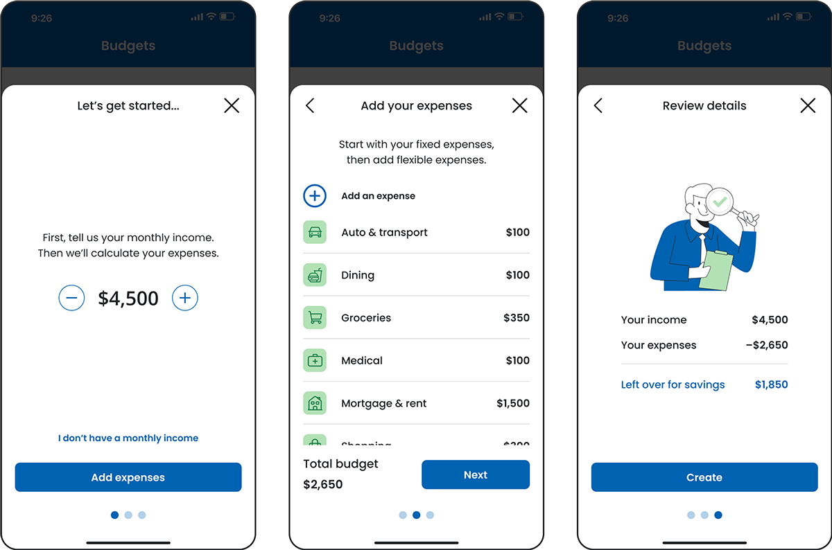
Create a Budget
Create a personalized budget and view insights. Transactions made through linked accounts will automatically be categorized for your budget.
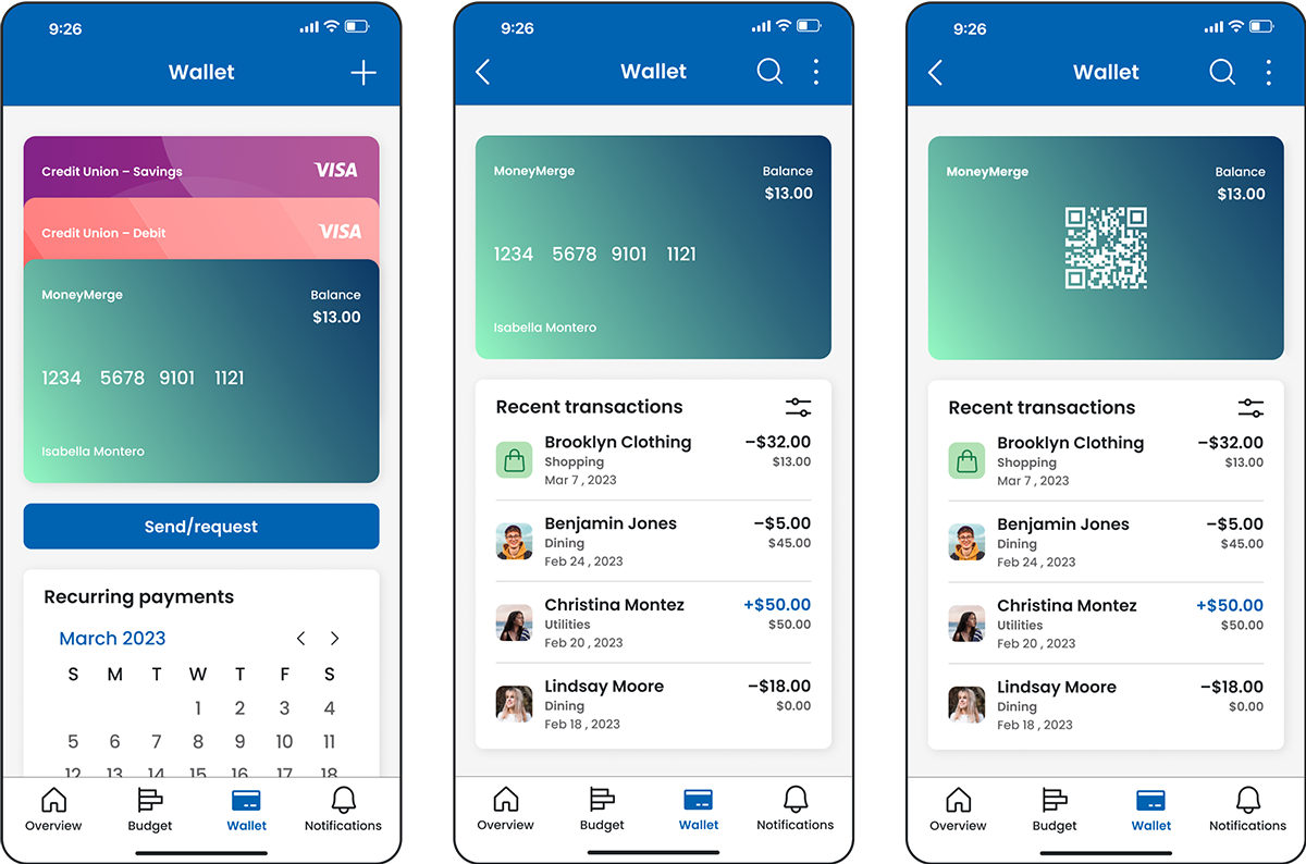
Wallet Tab
View your wallet to make in-store transactions by scanning the QR code. Get a calendar overview of your upcoming recurring payments.
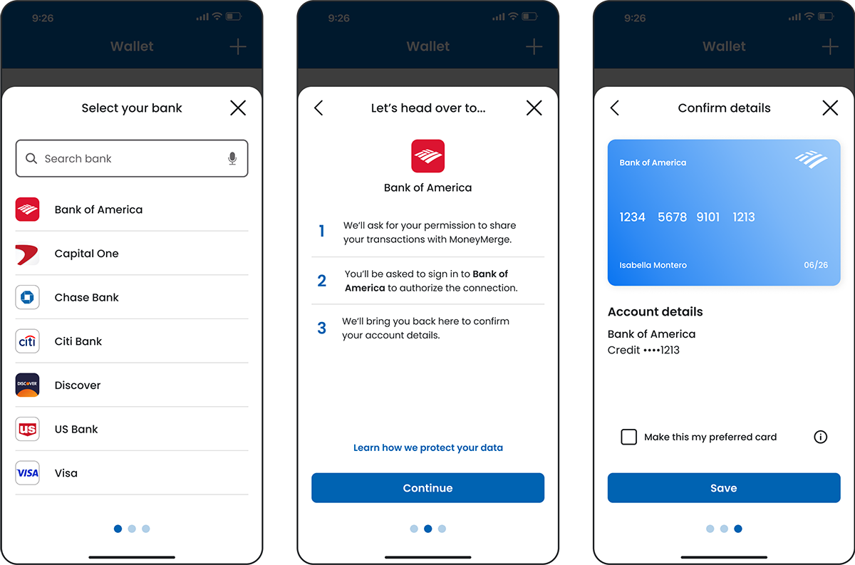
Add an Account
Find your bank, securely log in, and get a virtual card to make payments.
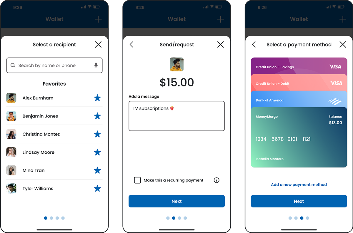
Make a Payment
Send or request money and set up recurring payments.
Visual System
Colors

Typography
Poppins
Bold, semibold, and medium used for headers.
Poppins
Medium and regular used for body text.
Iconography
Illustrations
Key Learnings
Design, test, repeat
I learned the importance of gathering feedback early and often through testing. And when testing isn't feasible, applying best practices to my design becomes essential.
Design for your users, not yourself
Early on, I realized the importance of avoiding design based solely on personal preferences and assumptions. Instead, I embraced the need to empathize with users and prioritize meeting their needs.
Don't try to reinvent the wheel
When evaluating the budget flow, I discovered that a linear path may not be helpful if users lack context and clarity about the desired outcome. To address this, I sought inspiration from existing apps.